

Are people able to read your website content on their mobile? If it is not then your website is driving away mobile readers.
Read this blog in your mobile to experience the readability of the content.
It is found that 40% users used a mobile phone to search any blog or article. 75% Americans used smartphones million times every day. This would continuously increase. They not only use their mobile phones to check email but also to read eBook, reply to any social media platform and read any blog.
All most all websites are available for functioning 24/7. Push more traffic toward your website is your success. If your website faces any problem which is described below then may be people will not read your content and leave your web page without reading the content.
Your words and your mobile readers
The way you read any book, blog, or article is different from the things that you are holding in your hands like a newspaper. You feel the different experience in every object.
In any post, your words, its font, layout, and design all are play an important role to read any content without any interruption. In this article, you can find the most important seven ways which cause driving away your traffic for mobile readers. Avoid these things to prevent your business from danger.
- Your font size is not readable
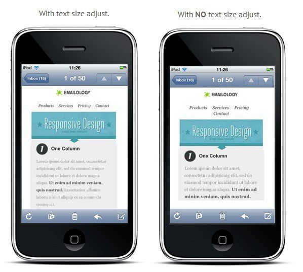
The size of your content really matters.
Not all font have equal worth. Some font and text looks good on a computer but not feel perfect when it is printing.
A small font will irritate in the eyes of a reader which cause reader back to the main webpage. Write a user-friendly font that feels readers great and easily readable to everyone.
According to the Google, they set the parameter of font size which is 16 CSS pixels.
In your website when there are buttons and call to action then you use larger font size. In a call to action, a large font will make a user to read easily. To check your website font readability, view your website on mobiles.do changes in the font until you feel comfortable to read the font on the mobile.
Also assure that your reader will not hold your mobile in front of their nose to read the text, which means he feels difficulty while reading the content
Always keep in mind that do a proper selection of your font that will suitable for your brand as well as the font that will easily readable to your mobile.
You might also like to read How Web Design Can Improve Your Traffic and Online Sales
- Auto play Videos
Readers are very intelligent and able to operate web page. So if they want to see a video they will click on the video. But if they do not want to watch it then do not irritate them through auto-play video feature. Especially auto play feel very irritating when you set in a quiet environment of office or do any important phone call. Auto play video behaves like an incursion in your privacy and it causes visitors to immediately switch from your website.
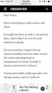
- Your website’s background is distracting
The background of your website should associate with your font not to create a problem during reading. Fancy images will turn your mobile into a nightmare. It is suggested to use a white background to avoid distraction. Or you can say that it is a technique to grab the attention of a reader.
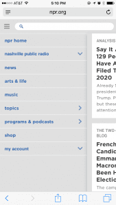
Just take a look at this screenshot for better understanding.
See how Google has optimized white space intelligently.
So know you can better understand the importance of white theme and background. Below there are some examples through which you can get a better idea of using white space on your web page.


So you may understand that I am trying to say that is a white background of these websites help us to read properly. Which attention of reading as well as minimize distraction element.
- Your website is cluttered
If your website busy and need more time to load on a phone then it creates a horrible experience for mobile users.
Imagine any website in which you read any content then suddenly any advertisement occur in front of content. Do you maintain the concentration in that situation?
Suppose the same thing will occur on your website. A cluttered website has a massive turn out for all readers.
Let’s take a look at some screenshots.

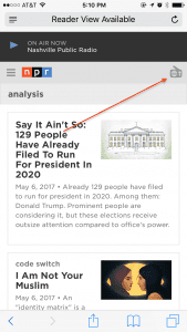
See this website which has a single column layout with white background and easy navigation for their readers.
When any user clicks on the radio icon which is located at the top right corner then there is pop up appear for a different radio program. You can also understand with this example that how effectively they optimized white spacing and all other elements.
- Your website is not responsive
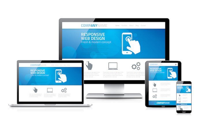
Does your website look the same on a desktop, tablet, and phone? If no, then it is an alarming situation for your website.
Your website must look cool on any device and adjust their content and alignment with the respective devices. This is called a responsive website design.
Rather than to create an individual website for a different device. It is suggested to design a responsive website. In this way, your website will automatically adjust their alignment according to the device that reader using.
This helps you to retain your customers and provide a great experience while visiting your website.
- Your Site’s Content Is Bad
There is no solution to cover this problem. Sometimes visitors move from your website to any other website because of its bad content.
Maybe your website is full of typo mistakes and bad content. Poor navigation, links with broken elements are given a very bad impression. Or maybe it contains unimportant pictures and difficult to read. The template looks like a rainbow surface, an old design of template which leads the perception to the reader that content is also too old and outdated.
Before final publication, it is important to read your content carefully again and again. Maybe an editorial improvement need.
Try to deliver a content that is informative as well as eye-grabbing and attractive. This point is very important or you can say that important pillar for your blog success and increase traffic to your website.
- Unclear ‘About Us’ or Contact Information
Be careful to maintain the good relation with your visitors or customer of your business. When you do business online then you should also design a medium where people contact you. So in your website must give a clear and brief introduction about who are you, what is your business and how your website suitable for visitors.
Give the contact information which you use all the time and try not to change this information frequently.
About Author Bio
Kristina Gordon is a business consultant, blogger and a content marketer. She provides helps to all people who want some Australian assignments help online for content writing. Kristina Gordon has provided his services independently through different online forums. She owns a cat and loves spending time with her friend and @kristinagordonp


Leave a Reply