
User experience (UX) design has traditionally been discussed in the context of stillness. We assume users are seated, scrolling, tapping, and viewing content in comfortable environments—at home, in the office, or perhaps during a quiet commute. But there’s a category of apps that challenges that assumption entirely: sports training apps.
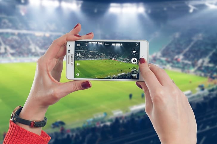
Apps like E‑Coach Pro – Soccer Training App, which deliver football coaching through mobile video, are not designed to be used from the couch. They’re built for movement. Users engage with them on a football pitch, in the backyard, or at the park. They’re sweaty, wearing gloves, possibly under the sun, with little time or patience for complex navigation or loading delays.
This creates a different UX challenge—how do you design an app for users who are literally in motion?
In this article, we’ll explore what apps like E‑Coach Pro teach us about designing for physical environments, where usability must align with activity, urgency, and real-world conditions.
Why Movement-Ready UX Matters More Than Ever
Mobile fitness and coaching apps have exploded in popularity, especially after the global pandemic pushed more users toward remote and self-guided workouts. As a result, people now expect their smartphones to deliver the same level of coaching once reserved for in-person sessions.
But when users are moving—running drills, lifting weights, and jumping between sets—the app experience can’t mimic traditional UX. A few key expectations rise to the surface:
Instant accessibility
Simple, gesture-friendly navigation
Minimal decision-making required
Low visual and cognitive load
Apps like E‑Coach Pro succeed because they understand these constraints and design for them, not around them.
1. Large Touch Targets and Gesture-Ready Interfaces
Let’s start with one of the most practical design elements: touch targets.
When someone is in the middle of a training session, they’re not carefully navigating menus—they’re tapping with urgency, possibly with sweaty or gloved hands. E‑Coach Pro uses:
Large, isolated buttons: So users don’t mis-tap or get frustrated
Simple swipe gestures: To move between drills or return to the session dashboard
Single-action commands: One tap to play, pause, skip, or restart
This ensures the experience is fast, forgiving, and functional—even in imperfect physical conditions.
2. Simplified Menus and Low-Friction Navigation
In typical productivity or news apps, users expect layers of navigation, filter menus, and detail options. That doesn’t work mid-workout.
E‑Coach Pro simplifies this with:
A flat navigation structure: Users are never more than 2–3 taps from their next drill
A clear drill hierarchy: Sorted by skill level and objective
Instant resume functionality: The app remembers where you left off and places you back into the session with no effort
By reducing the number of steps needed to launch or continue a session, E‑Coach Pro aligns perfectly with the mindset of users in motion.
3. High Contrast and Outdoor-Friendly Design
Consider the typical training environment: outdoors, in natural light, possibly under bright sunlight. Standard app colour schemes and text sizing often don’t translate well in these conditions.
E‑Coach Pro optimizes visibility with:
High-contrast colours (white on dark backgrounds or vice versa)
Larger font sizes
Minimal UI clutter, with plenty of negative space for focus
There are no distracting popups or unnecessary overlays—just clear visuals that are easy to read at a glance, even in harsh lighting.
4. Responsive Video with Quick Control
The core of E‑Coach Pro’s training lies in video coaching—short clips that guide users through drills and techniques.
To accommodate the active user:
Videos load instantly with pre-caching for minimal buffering
Controls are limited to essential actions: play, pause, skip back
- Auto-play next drill ensures a smooth transition without manual input
Because users may have their phone in a holder or propped on the ground, these features let them engage hands-free or with very minimal interaction.
5. Offline Functionality to Support Real Training Environments
A major part of sports UX is designing for real-world limitations, like spotty mobile data or no Wi-Fi in outdoor locations.
E‑Coach Pro supports this by:
Allowing offline access to the drills once downloaded
Saving session progress locally, with cloud sync when online
Keeping file sizes optimized so users can pre-load multiple sessions
This gives users freedom from dependency on perfect networks—an essential UX consideration that often gets overlooked.
6. Reduced Cognitive Load: One Decision at a Time
One of the lesser-discussed aspects of great UX for movement is decision fatigue. When users are exercising, their minds are already focused on form, breathing, timing, and performance.
E‑Coach Pro reduces mental overhead by:
Presenting one drill at a time, with no branching paths or options mid-session
Offering guided progression—users don’t choose what’s next; it’s structured
Avoiding distracting elements like social feeds or notifications during active training
This creates a mentally seamless experience, so users can stay in the flow of their workout without needing to “manage” the app.
7. Visual + Audio Cue Integration
Different users process information in different ways—some prefer visual instructions, others respond better to auditory cues. E‑Coach Pro accommodates both by:
Showing clear visual examples of drills through pro-shot video
Offering voiceover guidance to reinforce instructions
Using timing-based audio cues (e.g., “3 seconds left”) to keep users on track
By combining multimodal instruction, the app makes sure users can follow along without needing to stare at the screen the entire time.
Lessons for Designers Across Industries
While this article focuses on a football training app, the UX principles applied in E‑Coach Pro have broader implications for any app where movement and action intersect with digital interaction.
Think about:
Cycling and running apps (used on the move)
Warehouse or field service apps (used in gloves or harsh lighting)
Healthcare tools (used during procedures or hands-on moments)
Designers can learn from apps like E‑Coach Pro that anticipate physical environments and streamline user interaction for clarity, speed, and efficiency.
Final Thoughts: Designing for Context, Not Just Screens
Too often, UX is discussed as a screen-based discipline. But in real life, users bring context—physical, emotional, environmental—into every interaction. For sports and training apps, that context is movement, sweat, urgency, and focus.
Apps like E‑Coach Pro succeed not because they do the most, but because they do exactly what’s needed—and nothing more. They’re built with restraint, clarity, and purpose.
As more developers build for the “real world” instead of ideal settings, we’ll see UX evolve in more meaningful ways. And apps like E‑Coach Pro will remain a blueprint for how to design for action, not just interaction.


Leave a Reply